I’ve started sharing one trade per month to highlight the diversity of strategies running live—and to verify real performance using real trades with real capital. Each row of images features one or two randomly selected trades from one of my algorithms on any given market.
However, since we’ve begun raising capital for the fund, we’ve paused live trading operations temporarily in order to preserve capital and prepare for the fund’s official launch.
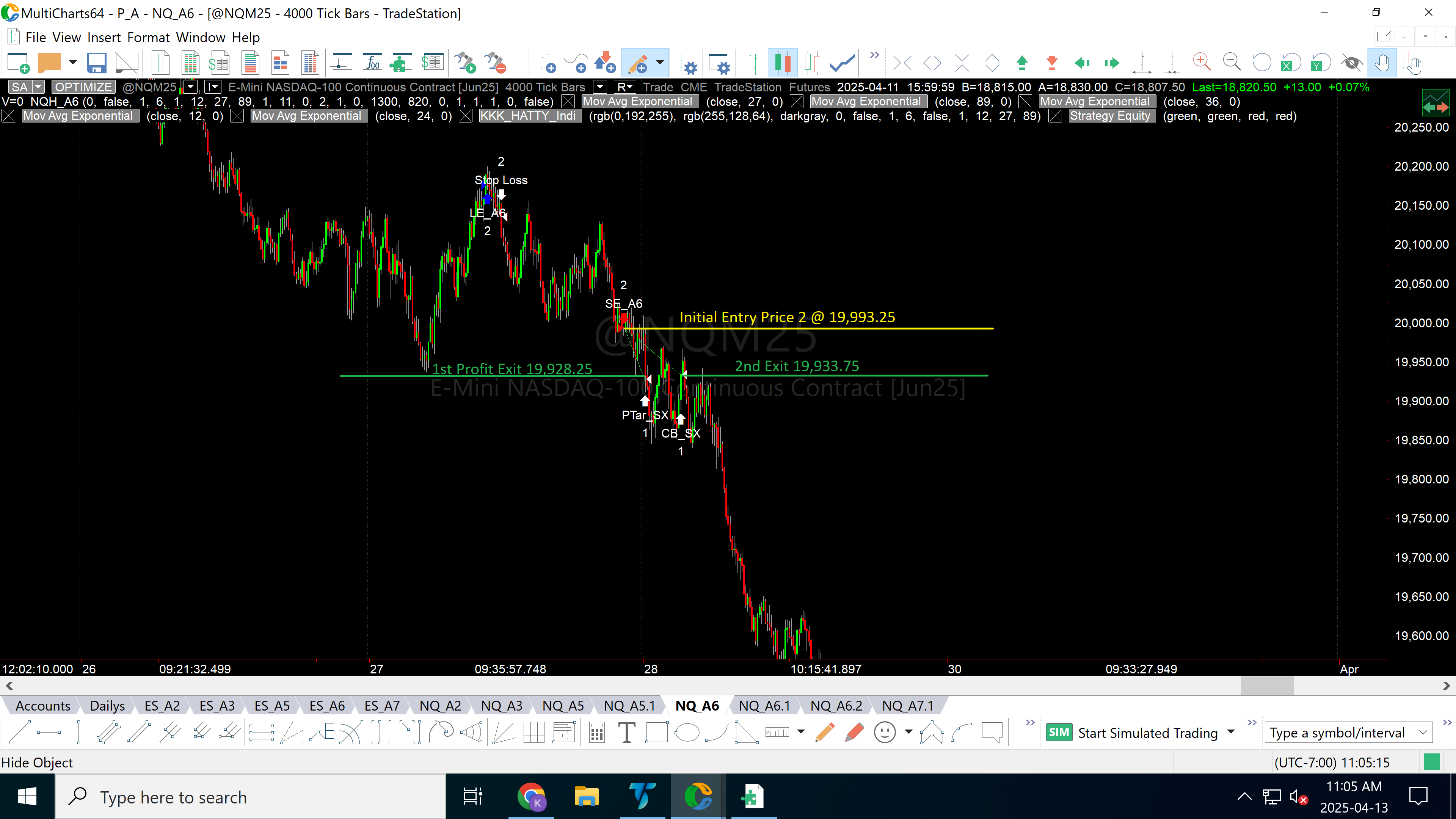
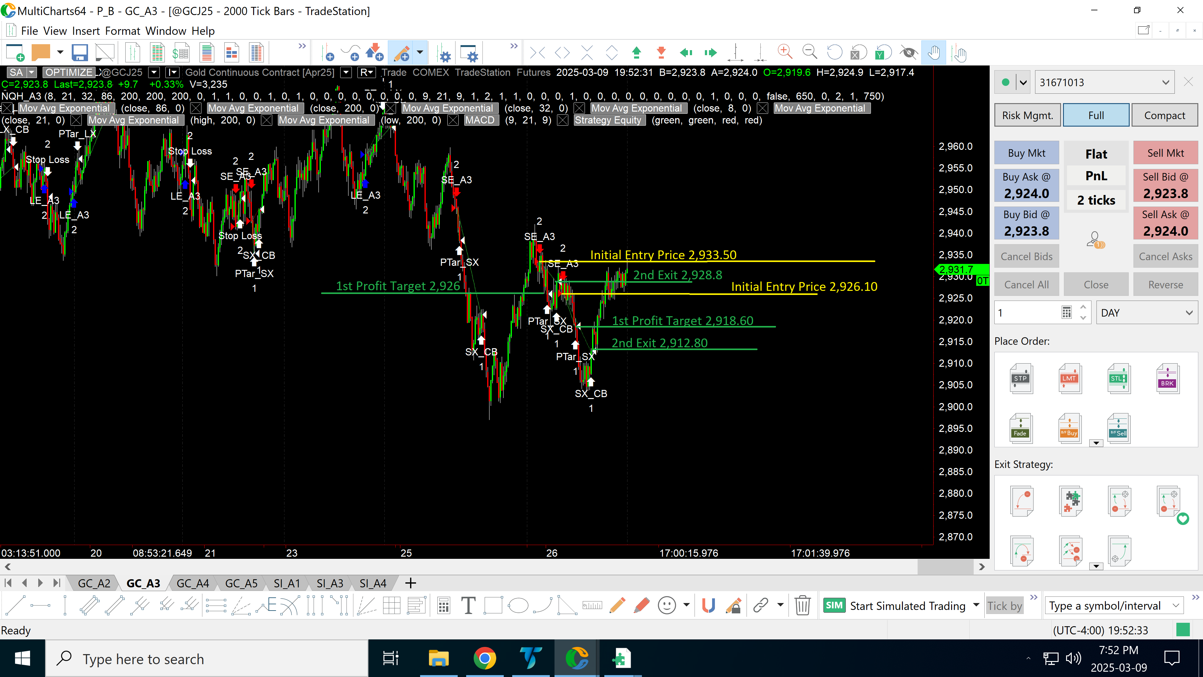
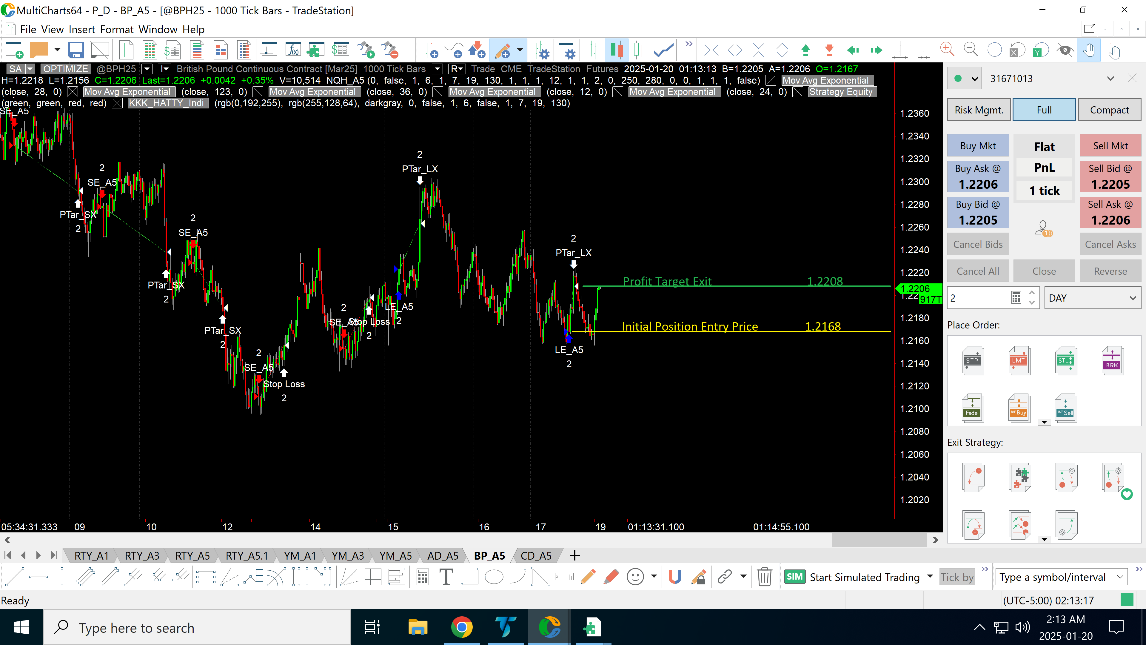
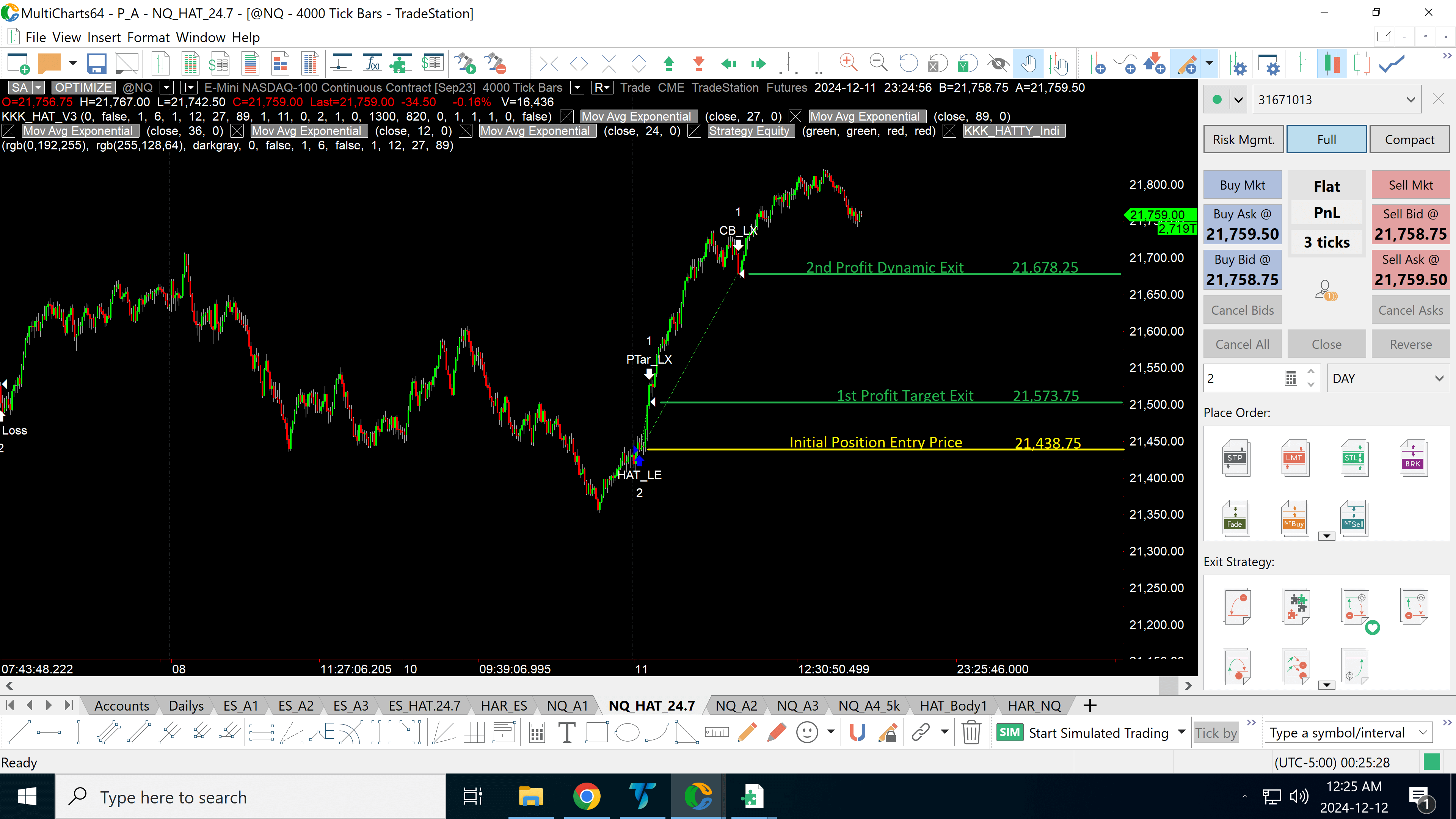
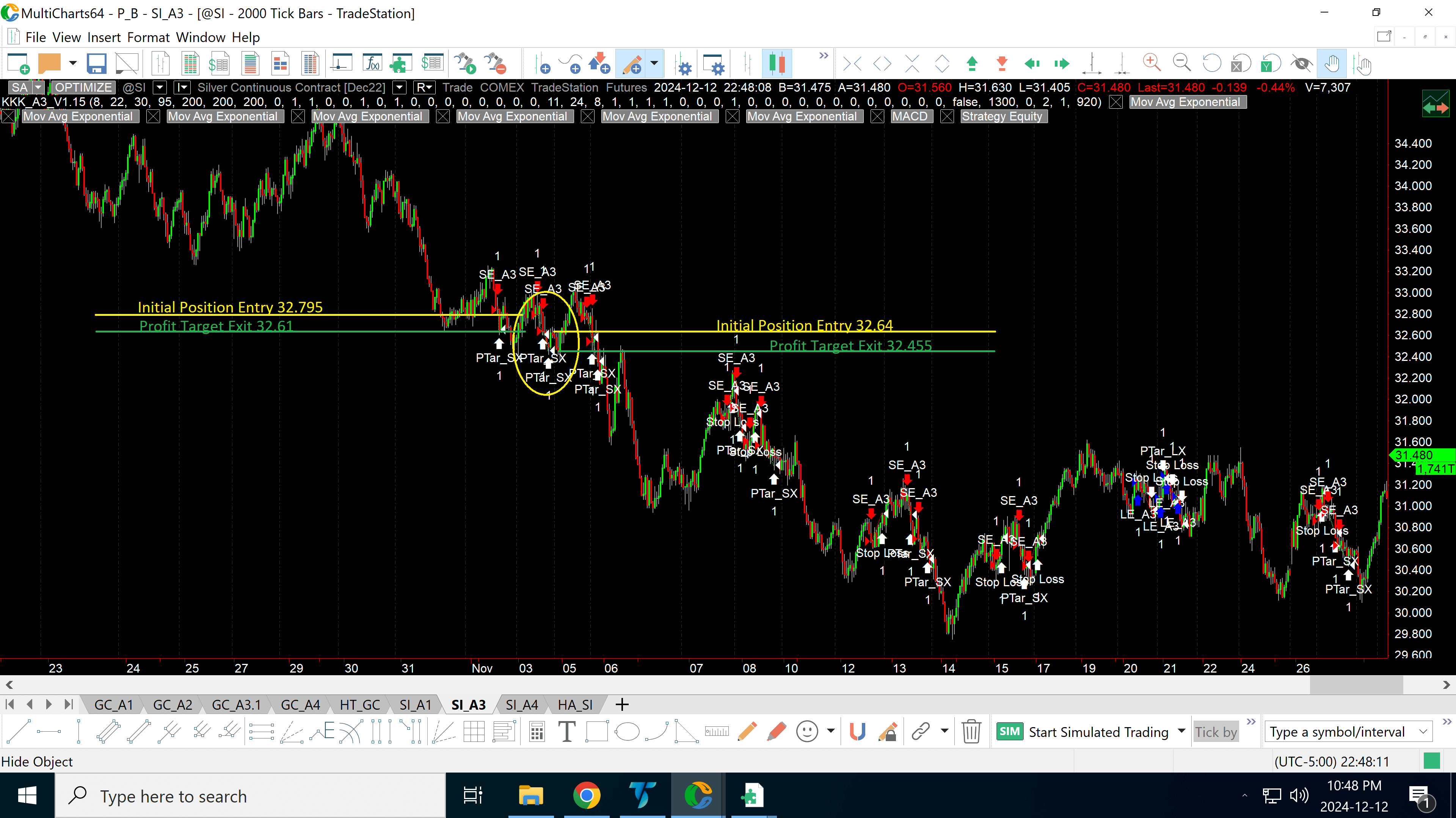
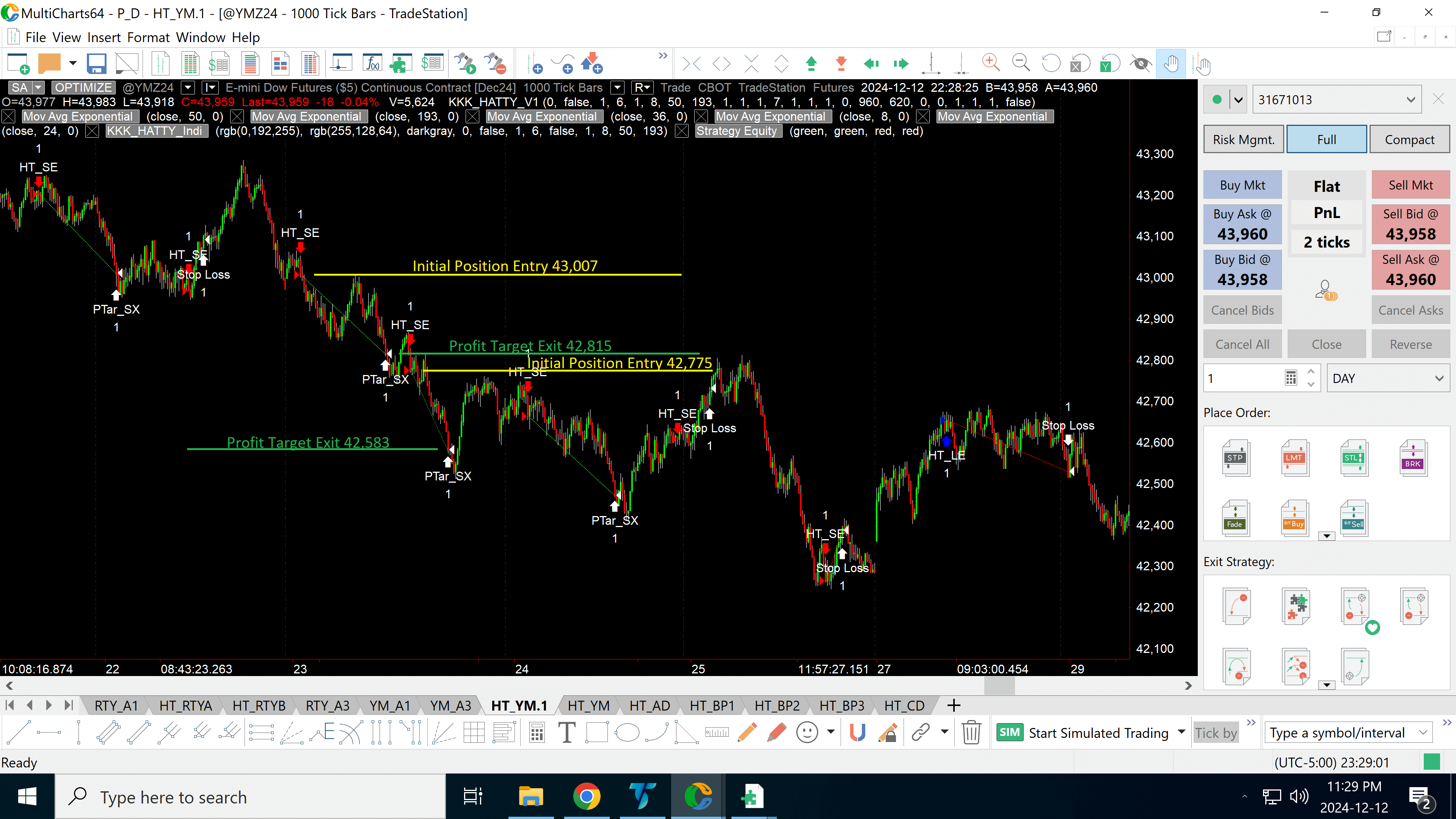
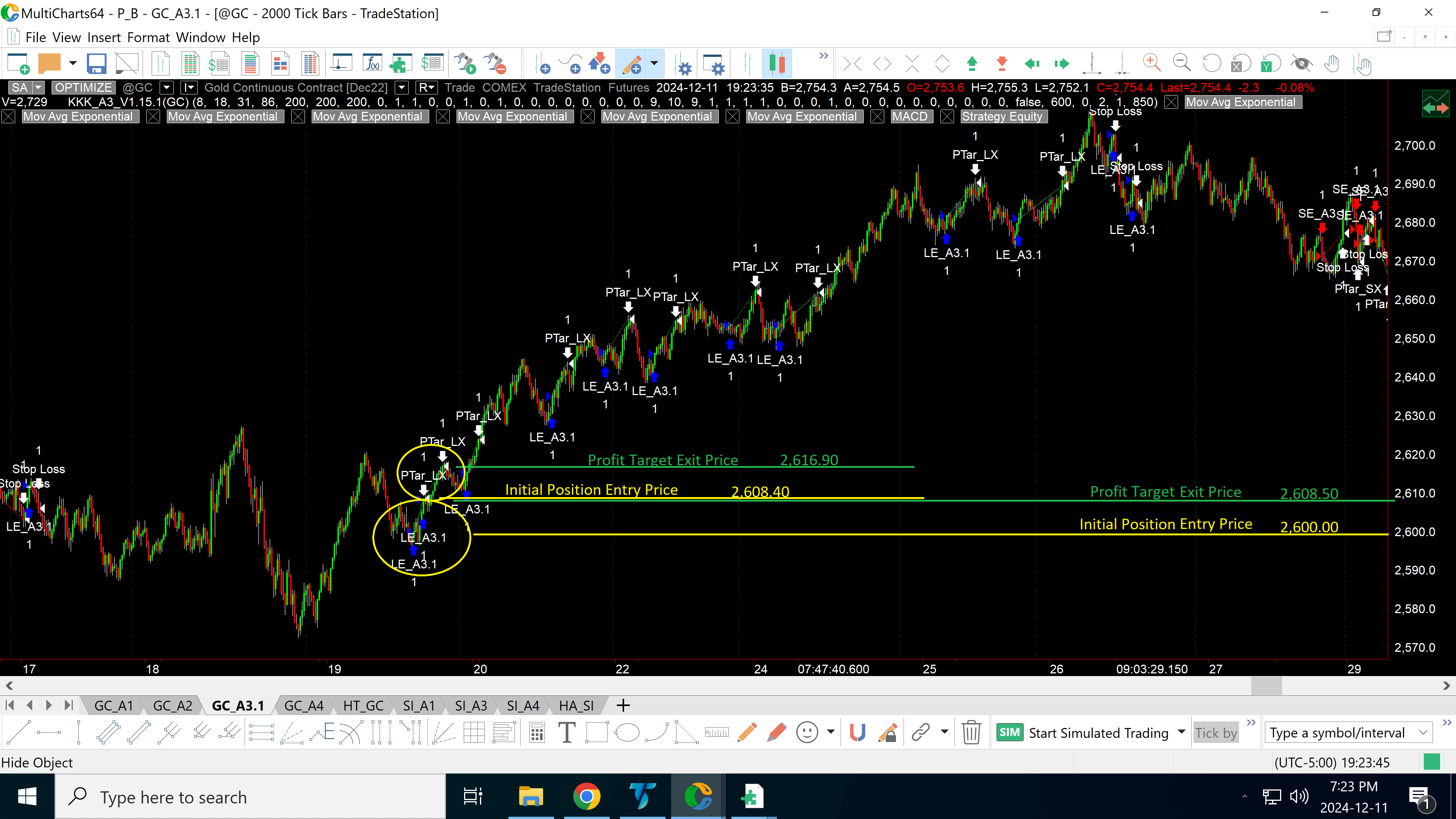
The first image (left) shows a chart with marked entry and exit points, based on live market conditions.
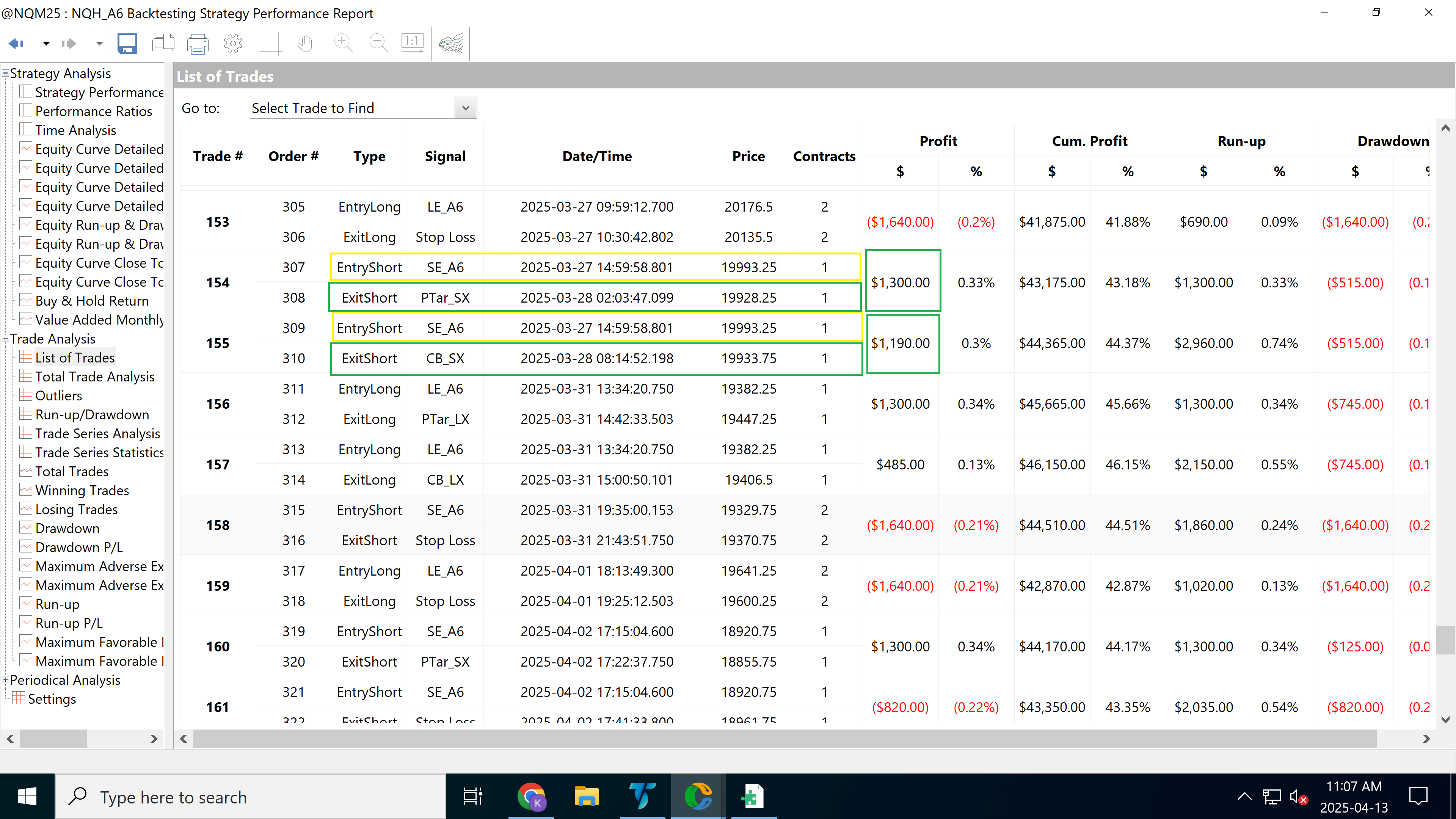
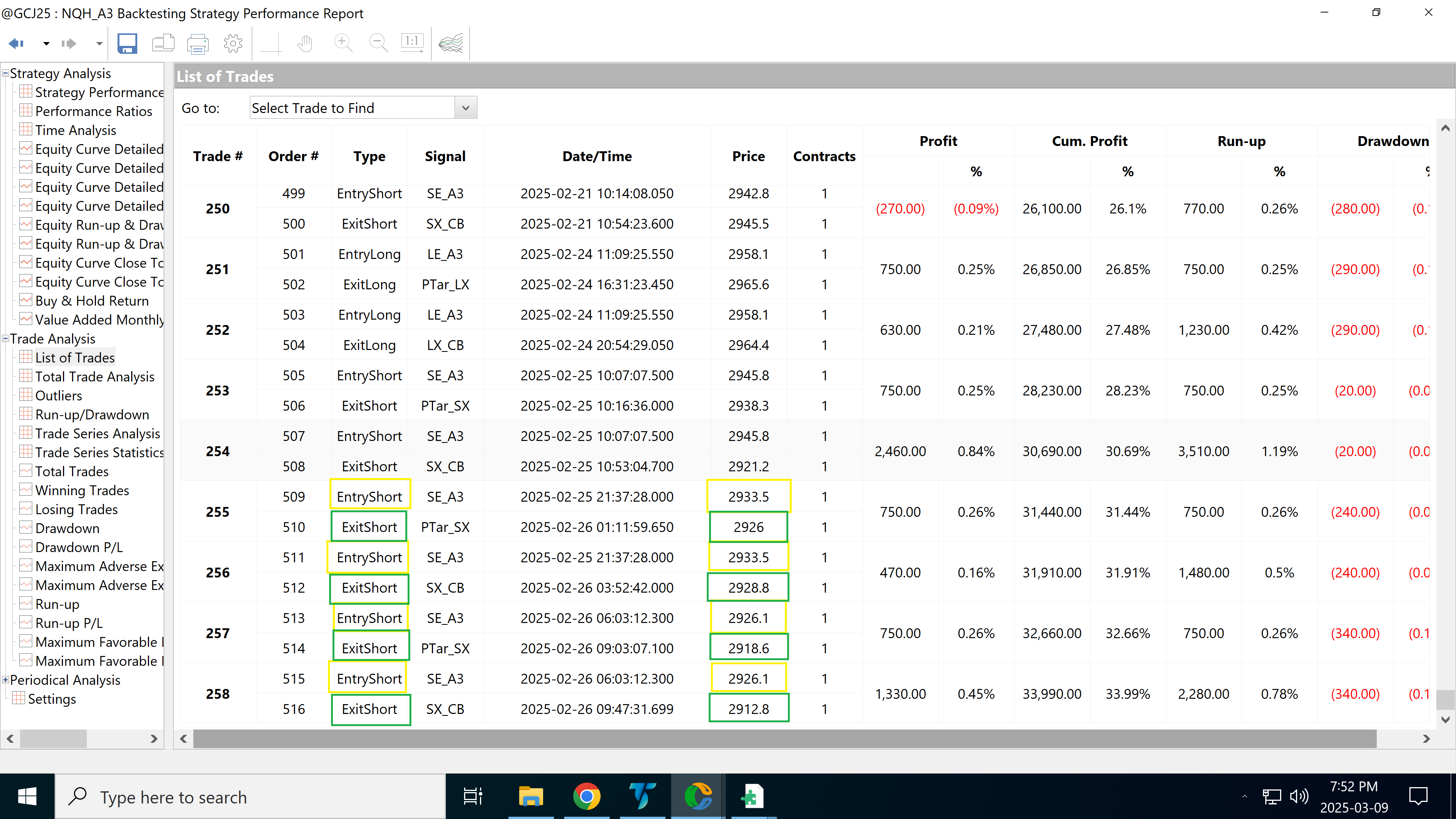
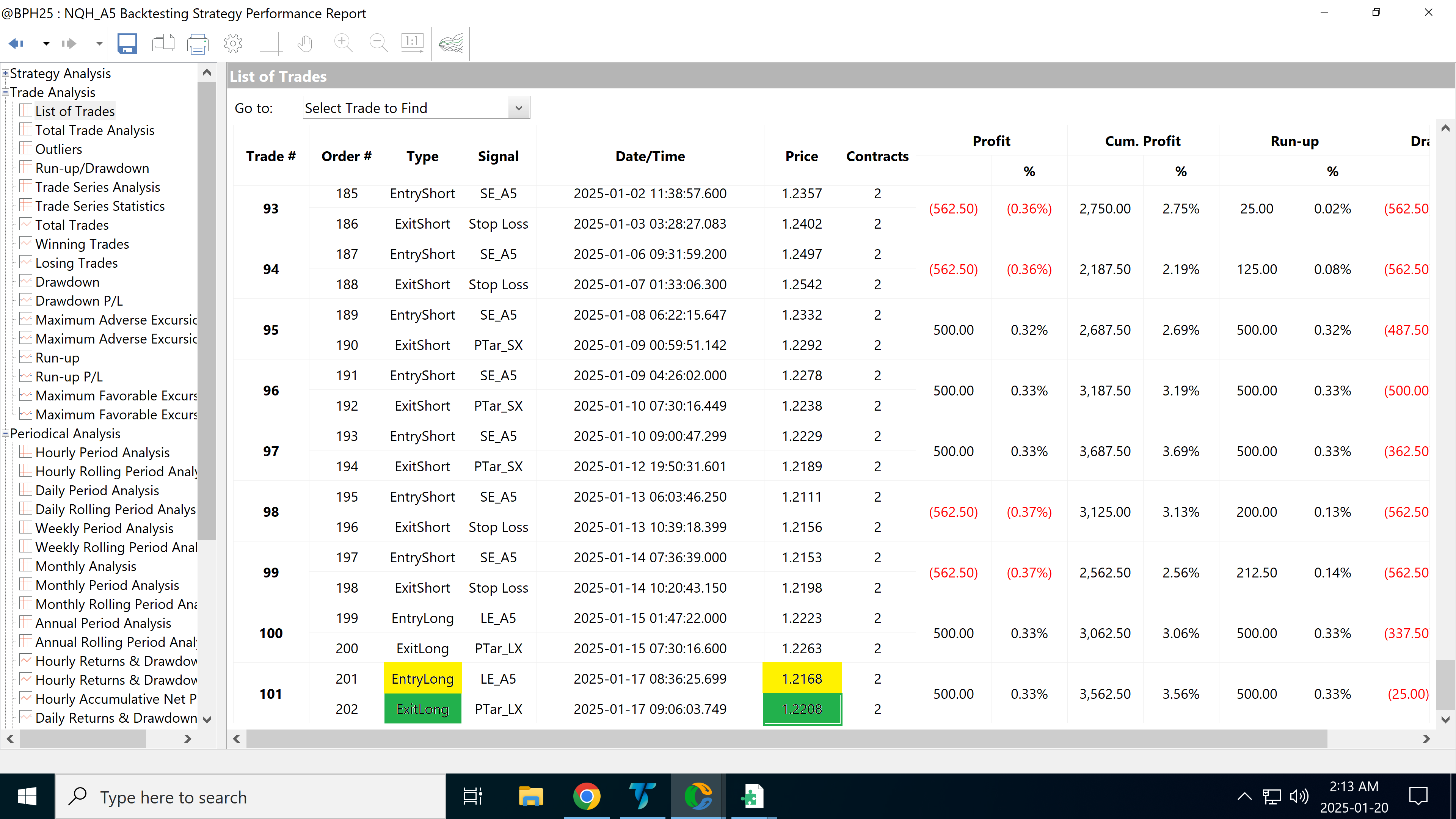
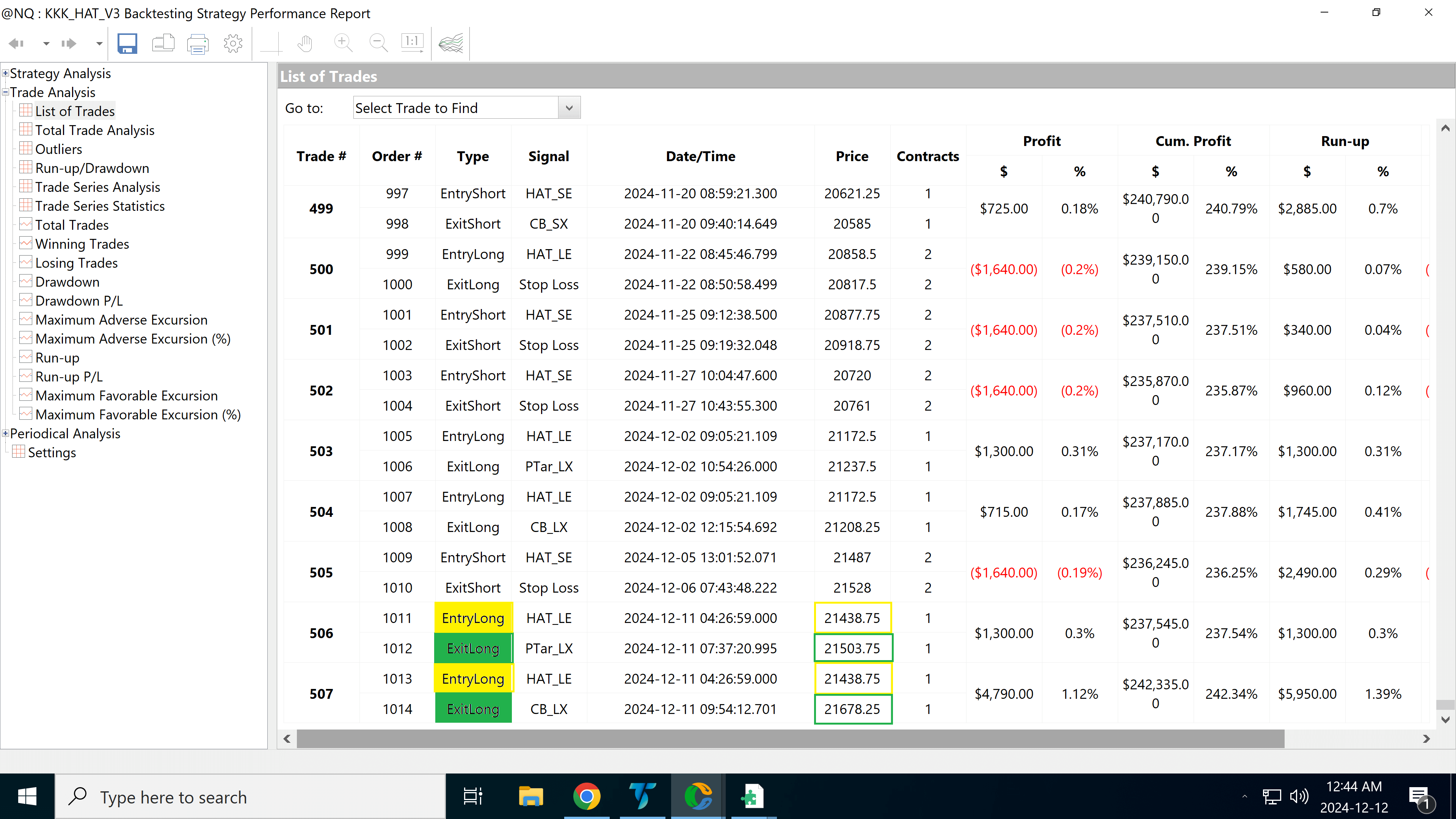
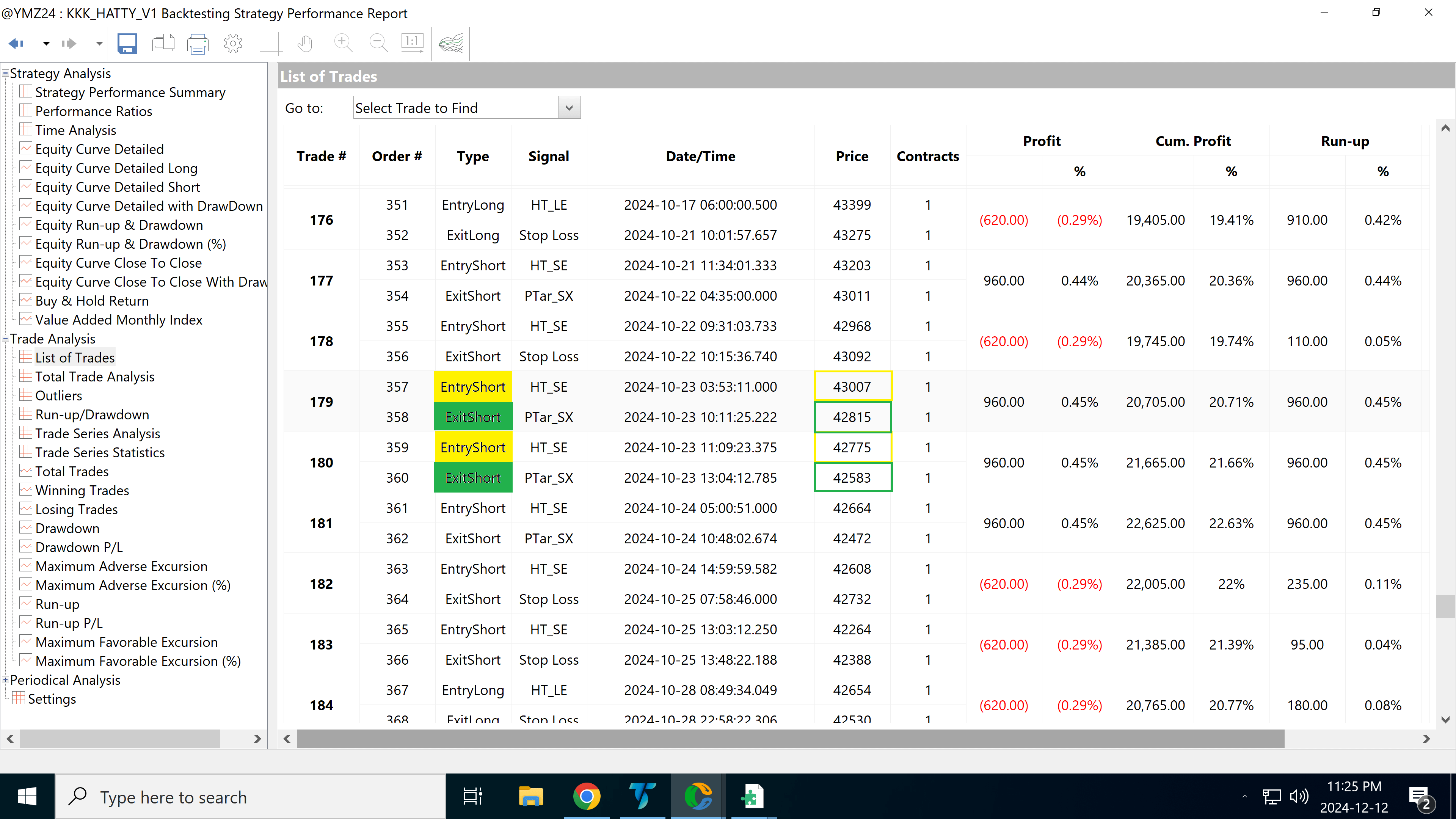
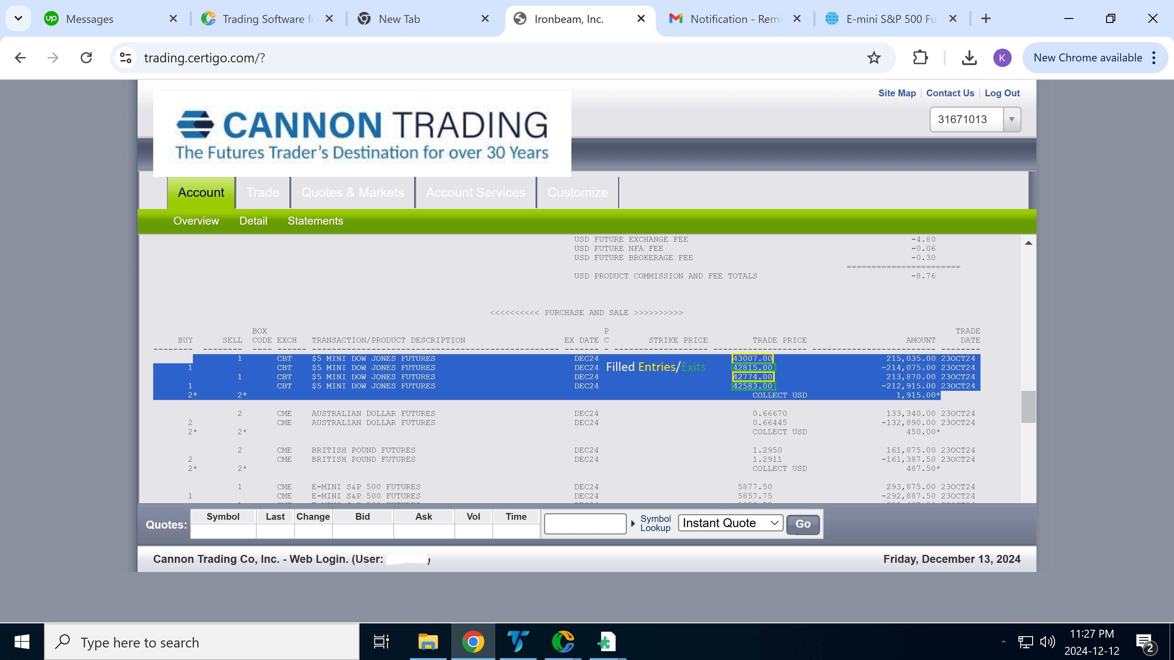
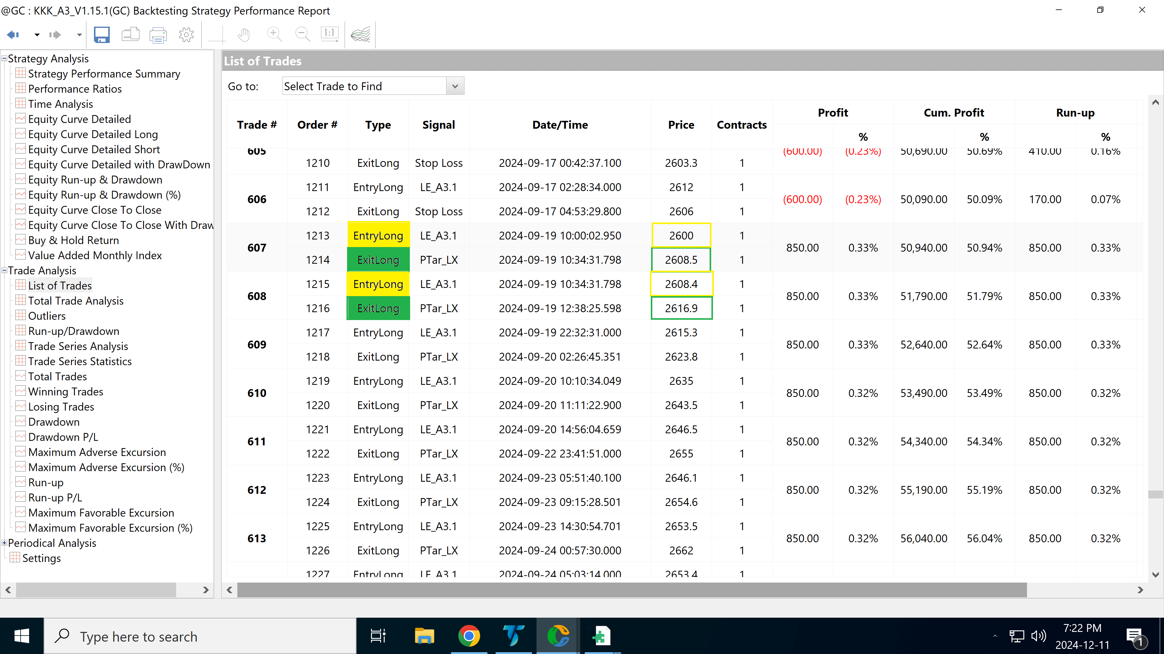
The second image (middle) is a screenshot of the strategy’s trade list, confirming the exact trade details generated by the algorithm in real time.
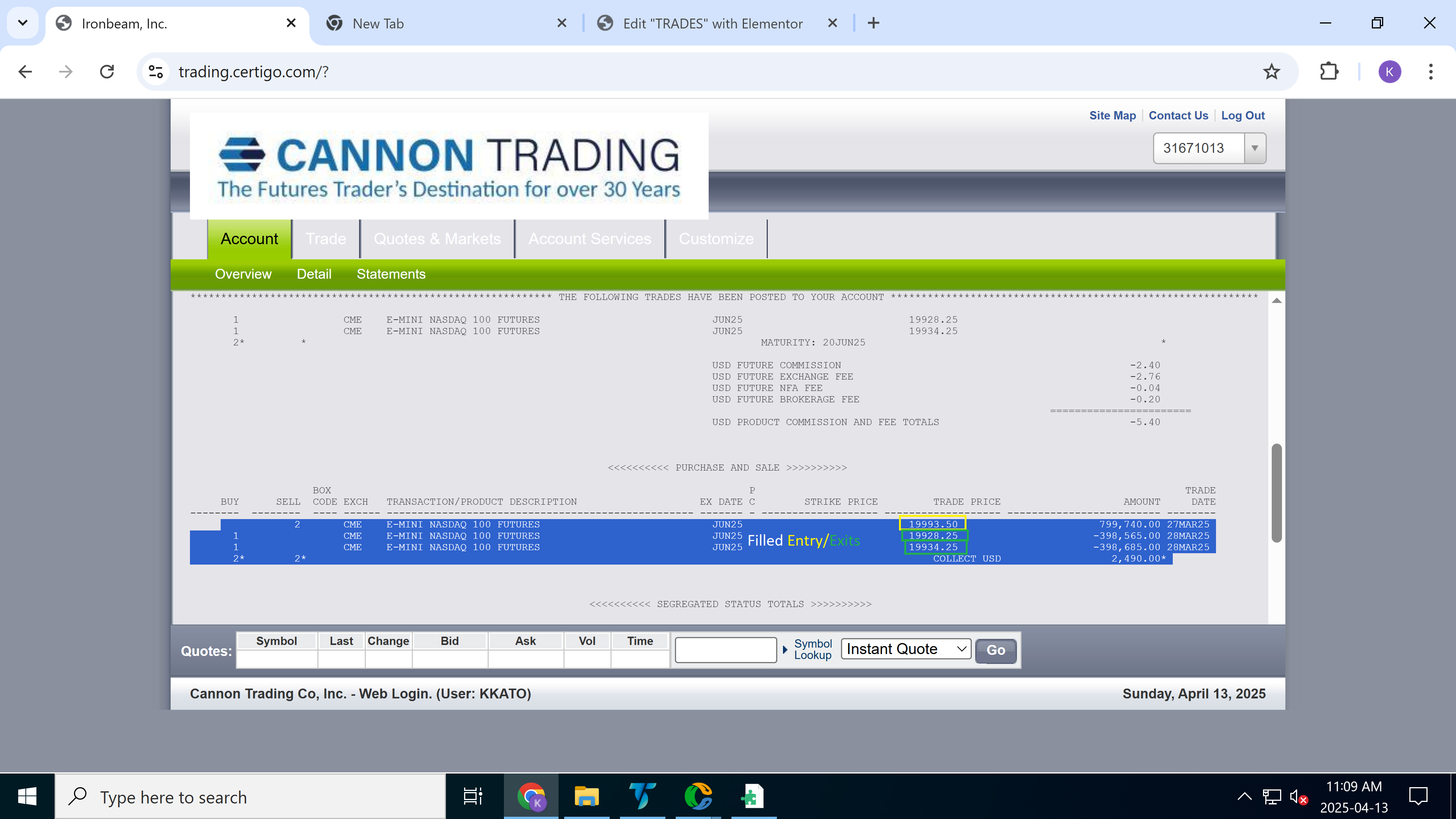
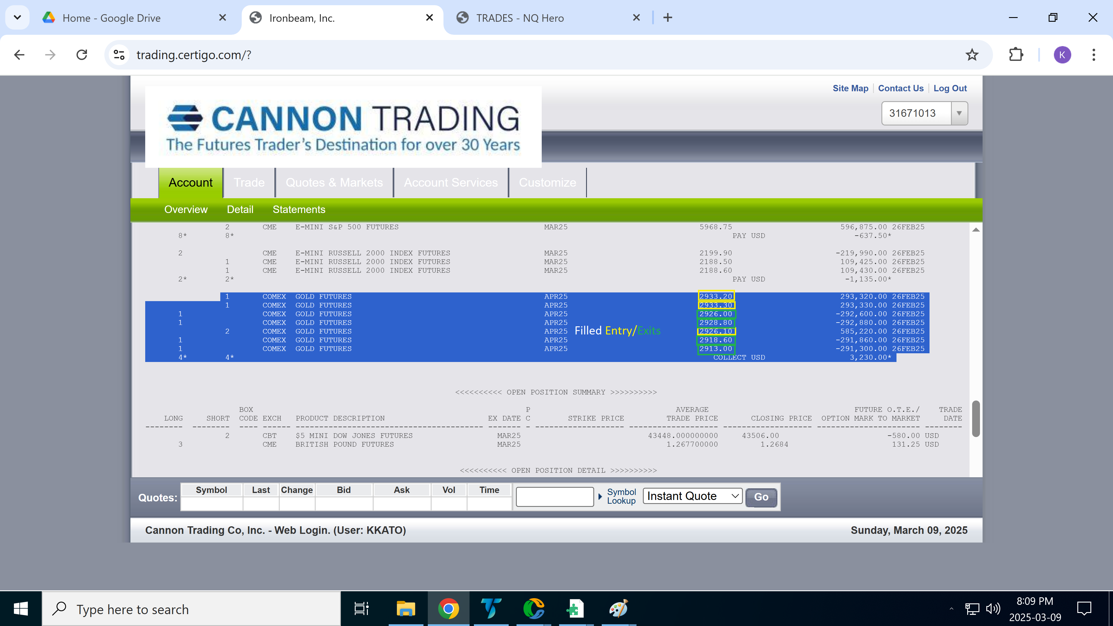
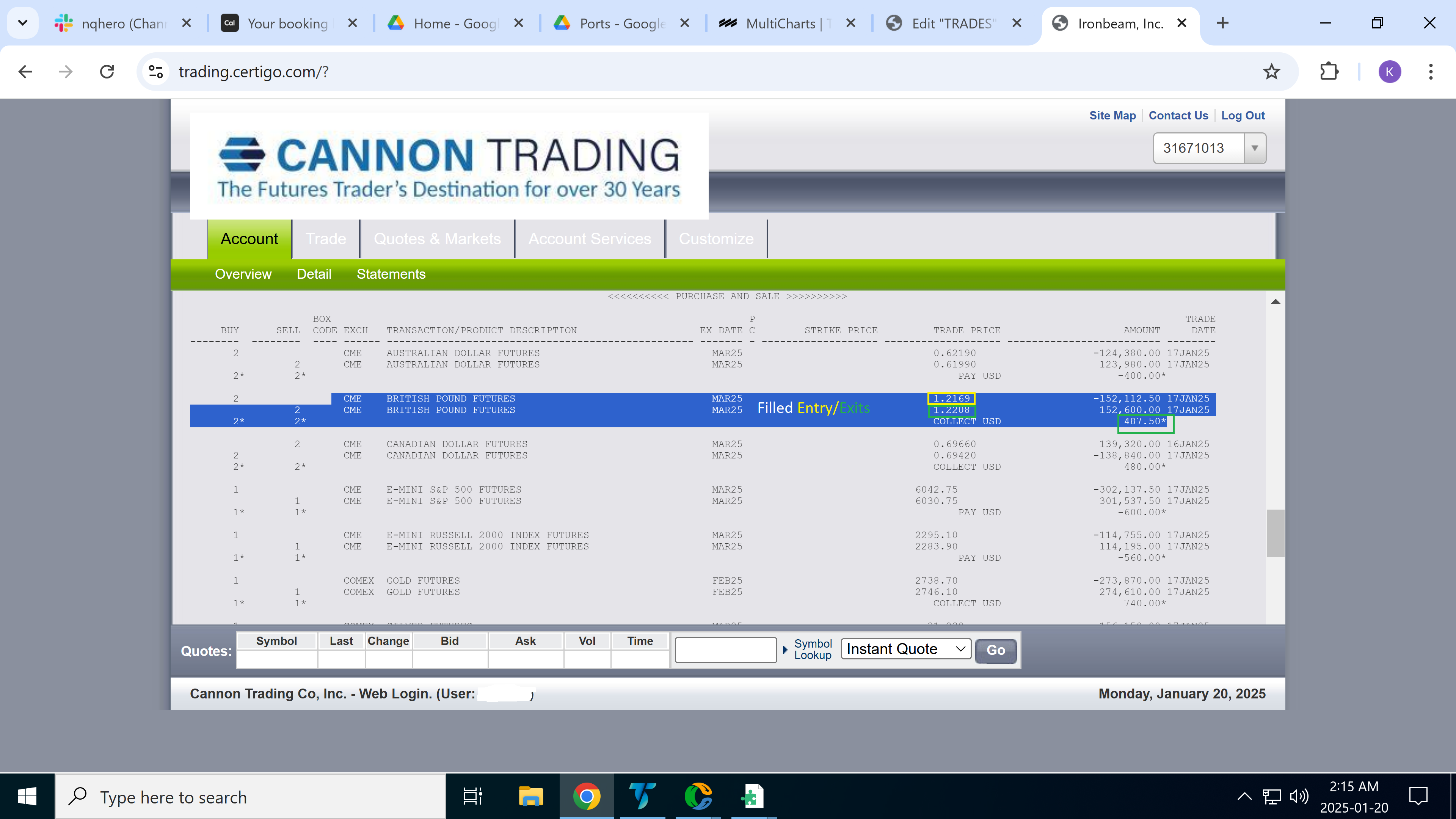
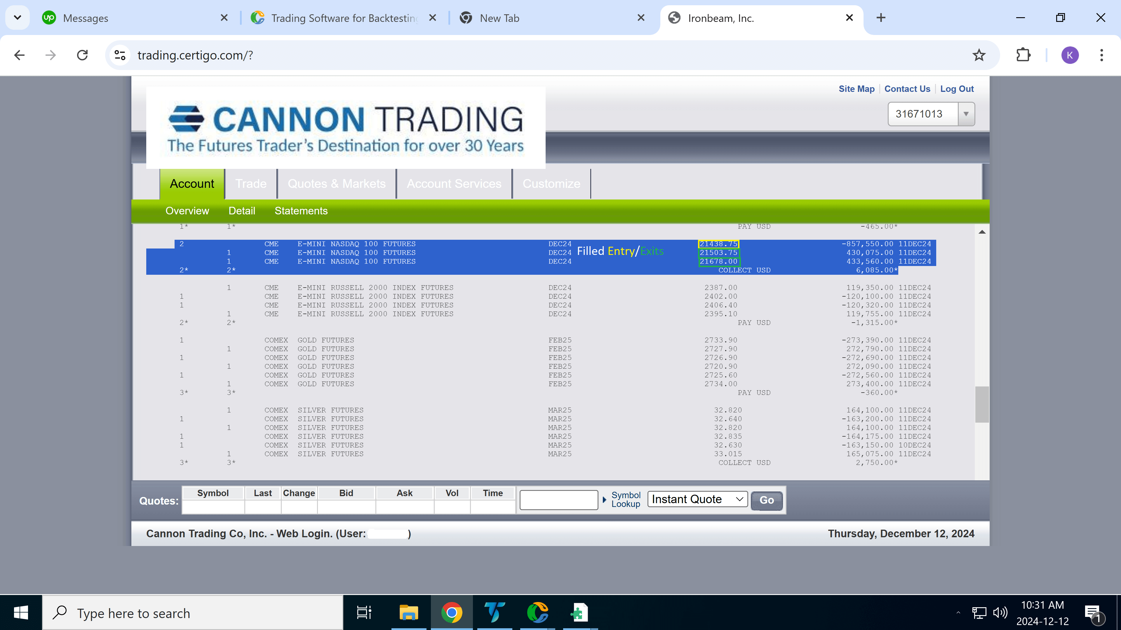
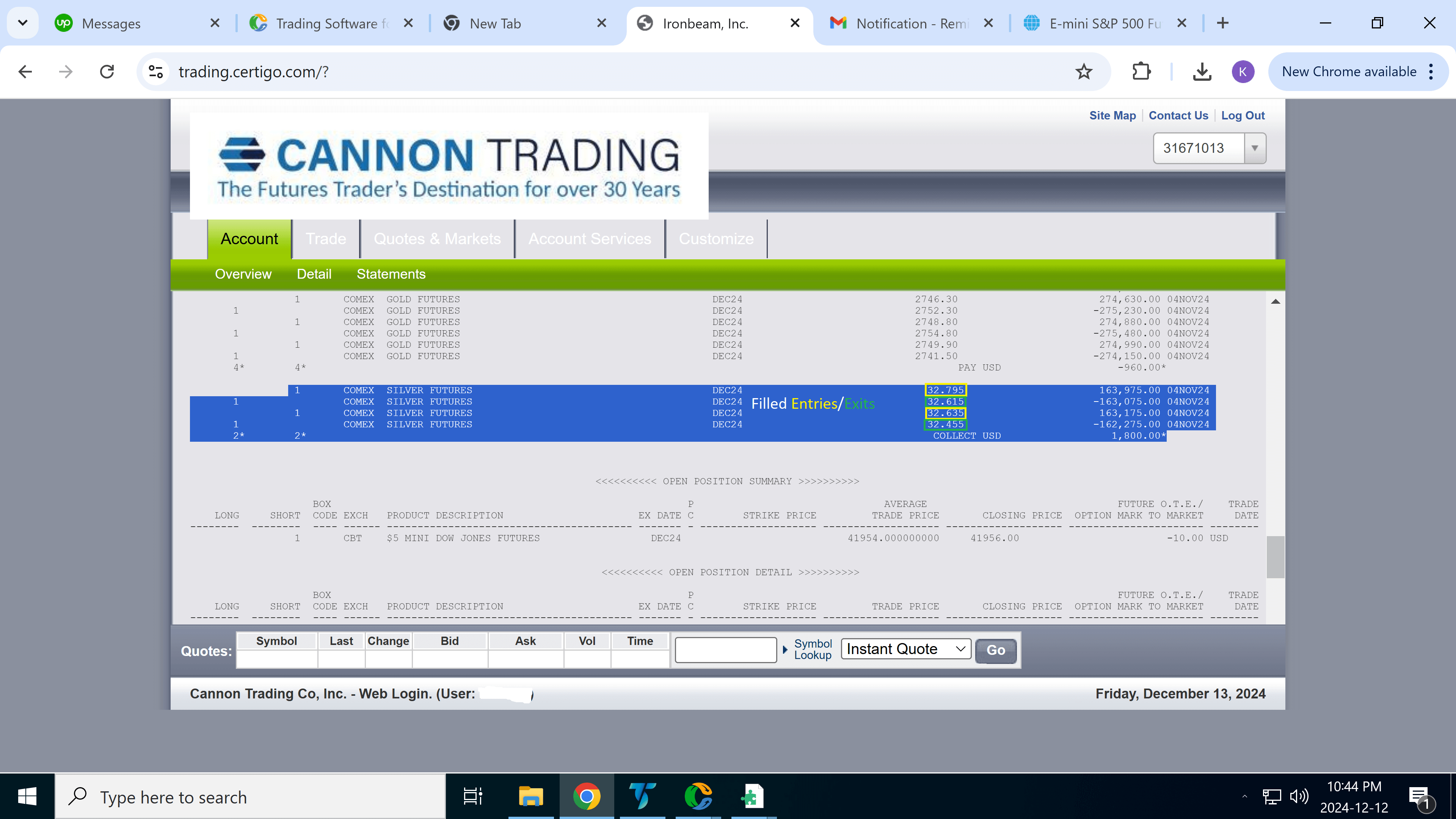
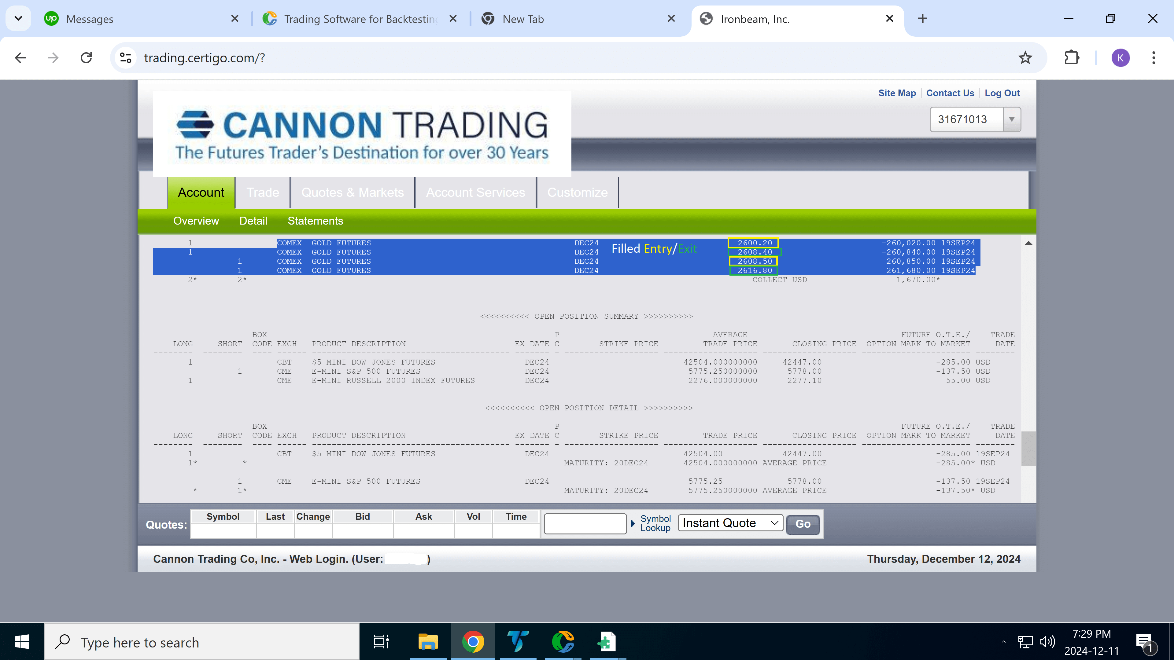
The third image (right) comes directly from the futures broker’s statement, showing the actual filled orders—matching the strategy’s trades nearly tick-for-tick.
Any minor difference in prices between the strategy and the broker (typically one or two ticks) is normal and due to slippage, a natural part of real-world execution.
This transparency is meant to showcase not just the effectiveness of each strategy, but the reliability and realism of how they perform in live markets.
March 28, 2025 – Nasdaq Short 2 Contracts
Strategy Profit Target Entry/Exit
Verified Filled Entries/Exits From Account With Real Money
February 26, 2025 – Gold Short 2 Contracts Twice
Strategy Profit Target Entry/Exit
Verified Filled Entries/Exits From Account With Real Money
January 17, 2025 – British Pound Long 2 Contracts
Strategy Profit Target Entry/Exit
Verified Filled Entries/Exits From Account With Real Money